The Red Lion:
Digital Modernisation
Revitalising a heritage pub brand to attract a new generation of digital-first customers without alienating the locals.
1. Visual Identity System
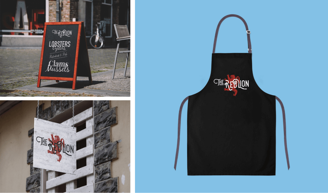
The Red Lion needed to move beyond the "old man's pub" stereotype. I developed a flexible identity system that works across physical signage and digital social assets. The red lion motif was redrawn to feel heraldic yet modern, creating a "stamp of quality" that could be applied to menus, aprons, and merchandise.

2. Digital-First Experience
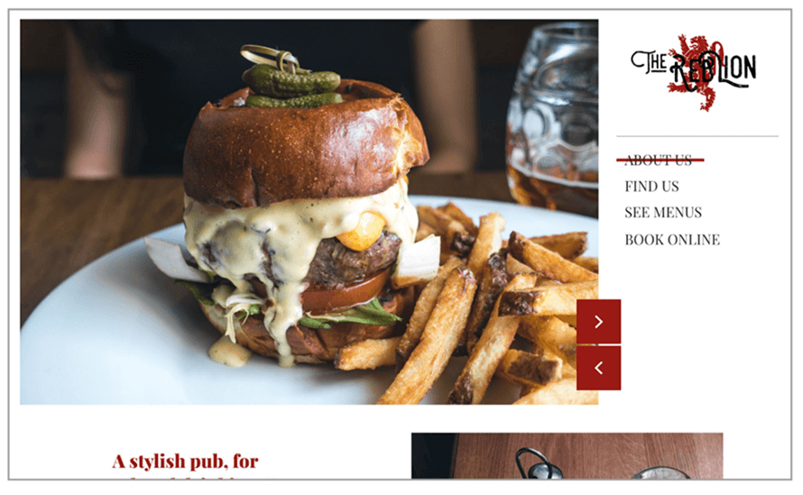
Most customers decide where to eat before they leave the house. I designed a mobile-responsive website that prioritises "Food Porn" photography and easy table booking. The layout is editorial and clean, using whitespace to elevate the perception of the food quality from "Pub Grub" to "Gastropub."

3. Converting Traffic to Covers
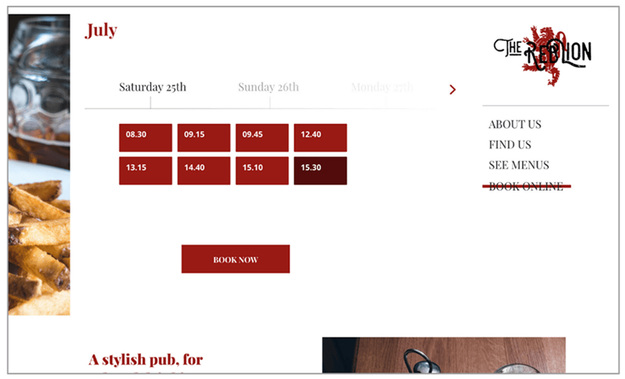
The primary business goal was to fill tables on weeknights. I integrated a clear "Book Now" CTA that follows the user down the page, along with a simplified contact section for large party enquiries. This reduced friction for users trying to make reservations on their phones.

Typography
Modern Serif
Balancing heritage with readability.
Colour Palette
Premium Warmth
Deep Reds & Charcoal.
Touchpoints
15+
Web, Social, Print & Signage.
The Concept Brief
The Challenge
This project was a self-initiated exploration into hospitality branding. The Red Lion is a ubiquitous pub name in the UK; the challenge was to take something generic and give it a distinct, premium personality that could compete with modern gastropub chains.
Brand Strategy
- → Heritage Reimagined: Using heraldic symbols but stripping away the clutter to work on small screens.
- → Mobile First: Recognising that most pub searches happen on mobile, "on the go."
Outcome
A comprehensive identity system that covers everything from the digital booking experience to physical menu design, demonstrating how a cohesive visual language builds customer trust.